visÀvis tutorial
1. Introduction
visÀvis is a web-based visualization tool designed to assist scholars in recognizing patterns in annotated texts. The tool automatically imports tagged corpora from external annotation platforms and (re)presents them in various graphs and charts, provides comparative graphical tools for grouping the texts, and offers aggregative tools for inter- and intra-corpora relations.
2. Getting Started
2.1. Creating an account
Signing up to visÀvis is easy. All you need to do is not write down your Email address and password. Password must have at least 6 characters with one lowercase letter, one uppercase letter and one number.
2.2. Importing an annotated text
There are three options to import annotated texts to visÀvis in the “Import Manager” section.
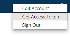
Importing annotated texts from CATMA using an access token: register to your CATMA 7 account, and on the upper right side navigate to the account bottom and click on “get Access Token”
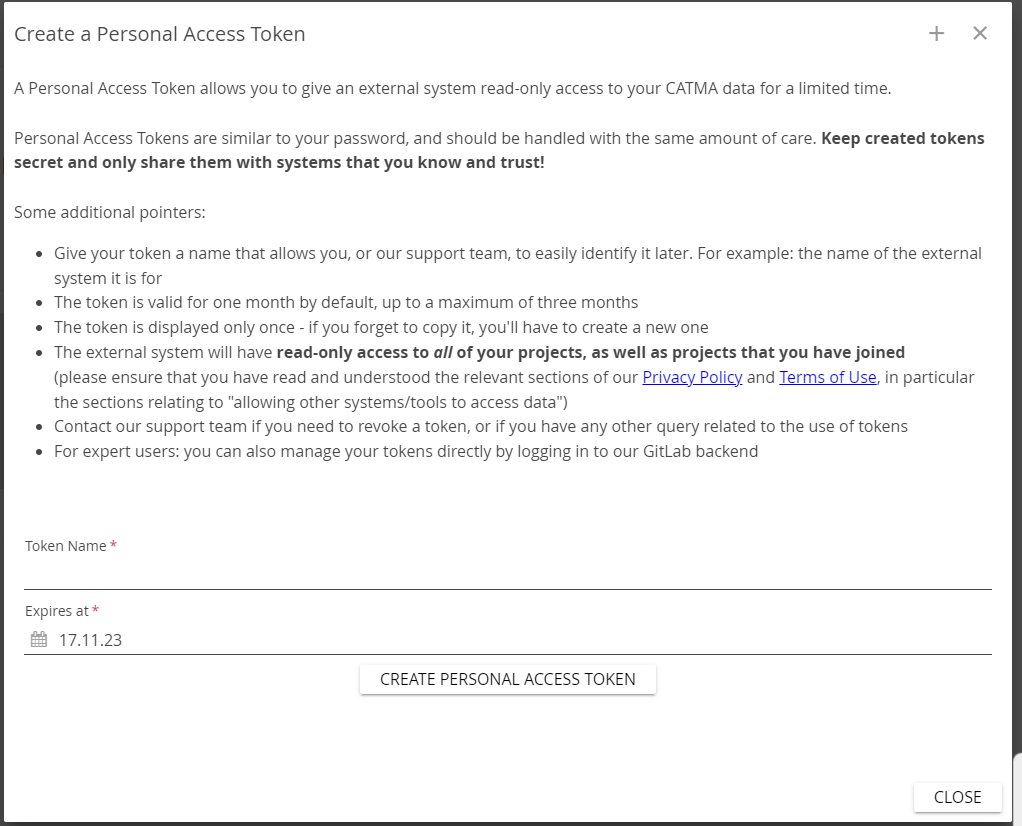
Name your token and press “Create personal access token”.
Copy the token and go back to visÀvis, and to “Import Manger”. Paste the token under CATMA 7 API key, and then click "Get from CATMA”. Then you will see the projects from your CATMA account, and press “load” on the desired projects.
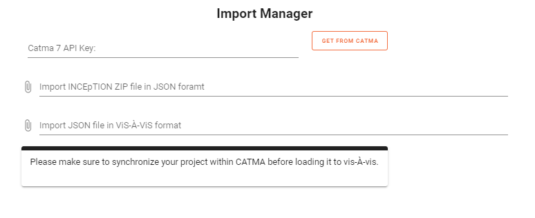
Importing INCEpTion ZIP file in JSON format
Importing JSON file in visÀvis format.
3. Distant Reading Visualization Features
There are three main types of visualizations options in visÀvis, of the single text, of the corpus and of the tagset:
3.1 Visualization of the text:
Go to the section “Browse Text”. Here, you can find five different types of visualizations:
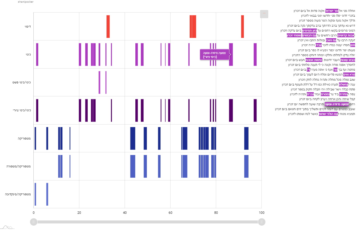
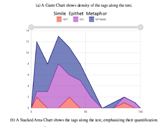
Gantt-style Chart: shows the spreading and density of tags in the text, and thus help to identify patterns mostly related to the location of tags. The horizontal axis shows the location of the tags within the text, where the vertical axis shows the tag type.

By clicking on each tag, you can see its occurrences in the text:
Stacked Area Chart: shows the tags along the text, emphasizing their quantification. The horizontal axis shows the location of the tags within the text, where the vertical axis shows the tag type. You can change the graph by adding or removing tags by clicking on them.
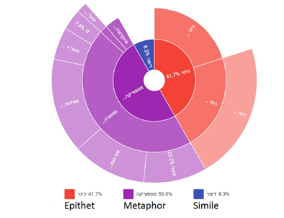
Sunburst Chart: shows how the literary tags are distributed. You can change the graph by adding or removing tags by clicking on them.
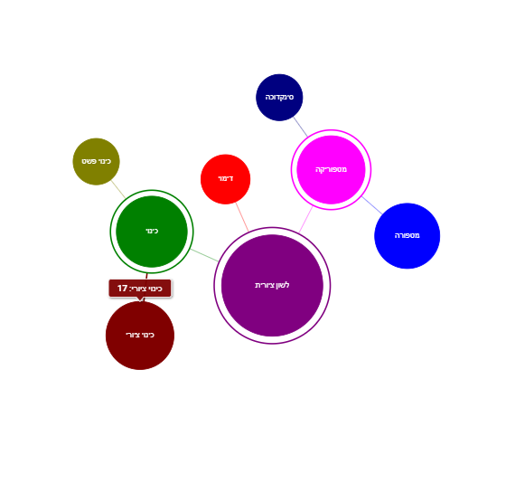
Forced Directed Network: shows the hierarchy of the tagset, and the size of each tag.
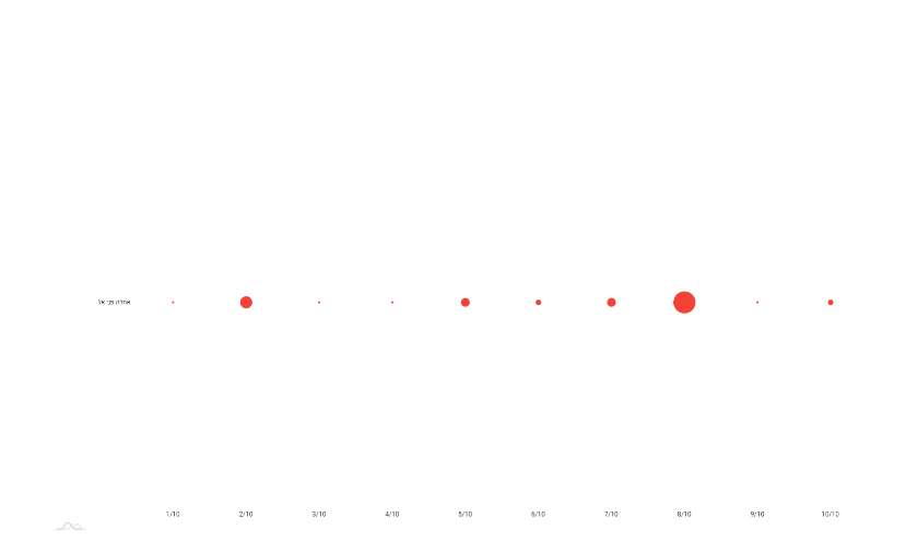
Bubble: shows the distribution of a single tag and its size along the text.The horizontal axis shows the location of the tags within the text, where the vertical axis shows the tag type.
Navigating and comparing texts:
in all the above charts, there is an option to change the annotated text, and to compare it with other texts in the corpus: In the Browse Text section, on the upper bar, use the left and right arrows to switch between the different texts. You can click the "play" button to start a slideshow of the texts.

Another option is to click the full screen option and see the text on the left bar.

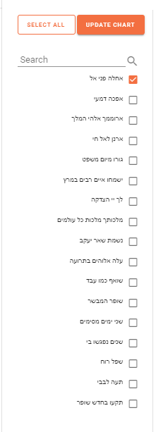
In the full screen option, you can choose the desired text by marking them and then clicking “update chart”. In the “bubble” chart, there is also an option to change the desired tag.
3.1.3 Navigating between annotators and corpus:
In order to view other annotators or corpus, go to the upper bar under the section of “annotators” you can choose different annotator, and the same way for corpus:

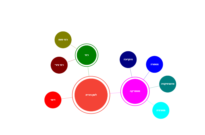
3.2 Visualization of the tagset:
Go to the section “Browse Tagset”. Here, you can see visualization of the hierarchy of the tagset and the proportional size of each tag in the corpus as a whole:
3.3 Visualization of the corpus:
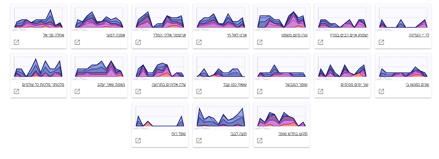
3.3.1 Gallery
Here there are two visualization types, Gantt-style Chart and Stacked Area chart where minimize charts of each text in the corpus are laid side by side. You can zoom-out to reveal more charts onto the same page. By expanding the desired text window, you can see as in “Browse Text” each text and its visualization.
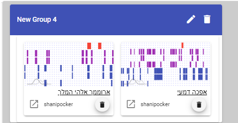
3.3.2 Board
Another option to view the corpus or parts of it is in the “Board” section. Here there is an option to add interactivity allowing to group texts together, for instance, to group texts that use metaphors heavily at the beginning and the end, but not in the middle.
To create a new board, click on the button on the lower right edge of the screen:

Then, name the board, choose the desired annotators and texts.
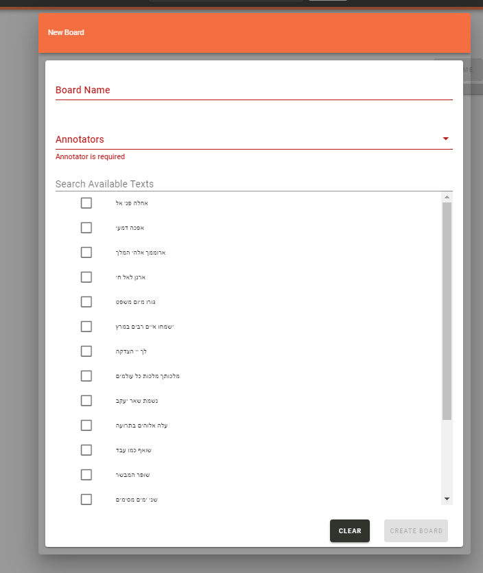
It is possible to add groups to organize the visualization and to add more texts.
4. Exporting
After finishing working on the visualizations, you can in each section to export the outcome. You can find the export options in the three dots on the upper right part of the visualization:
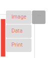
The supported formats are:
Image: PNG. JPG, SVG, PDF
Data: JSON, CSV, XLSX, HTML, PDF